Tarout Charity
A complete visual identity for a charity on Tarout Island, from the mark to the brand guidelines.

The idea
Castle over the waves,in one mark.
For almost sixty years the society has served the people of Tarout Island. It asked for a new identity that carries the weight of that history, points to Tarout Castle and speaks of the giving it stands on. So I started with the place itself.
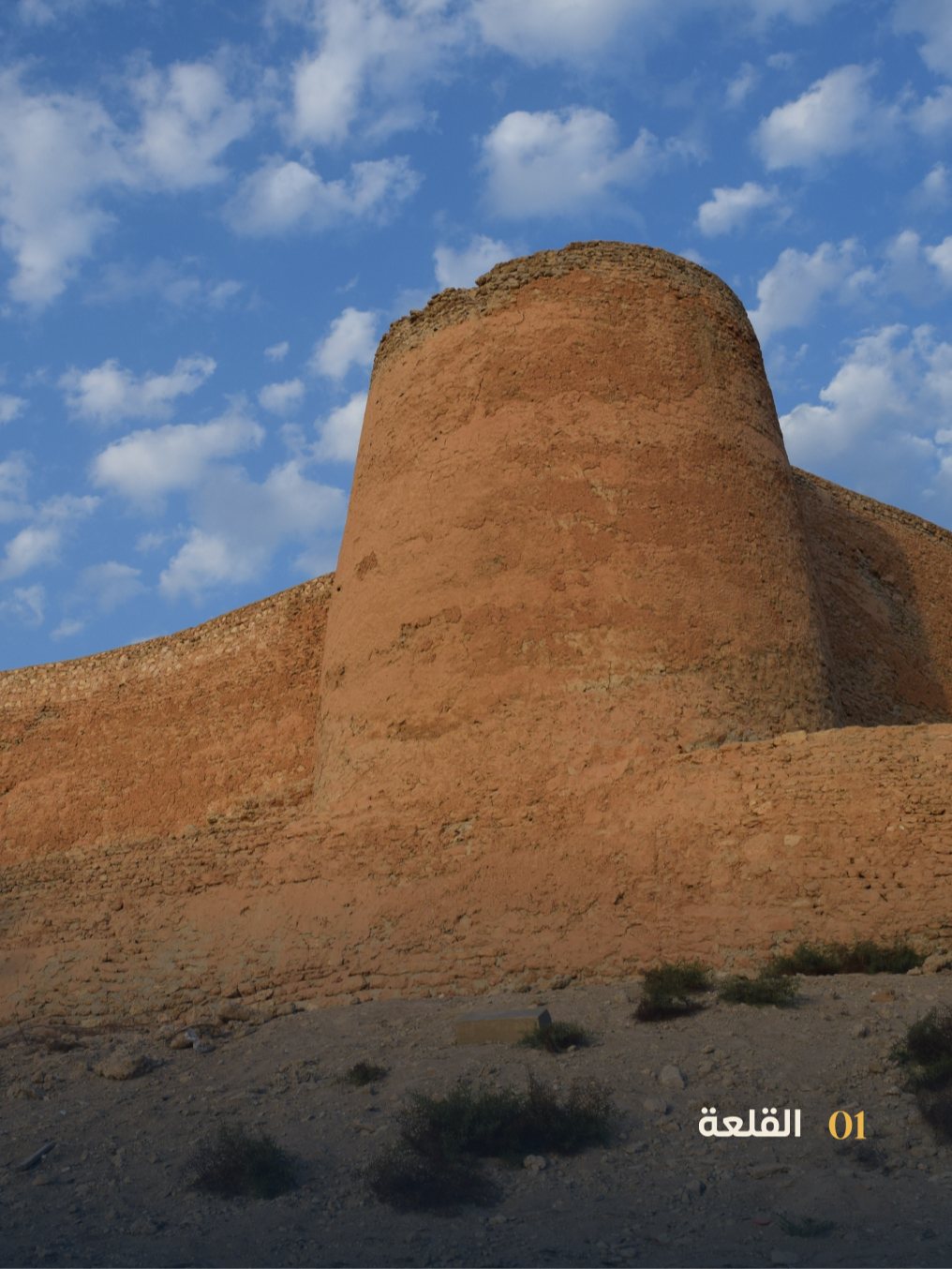
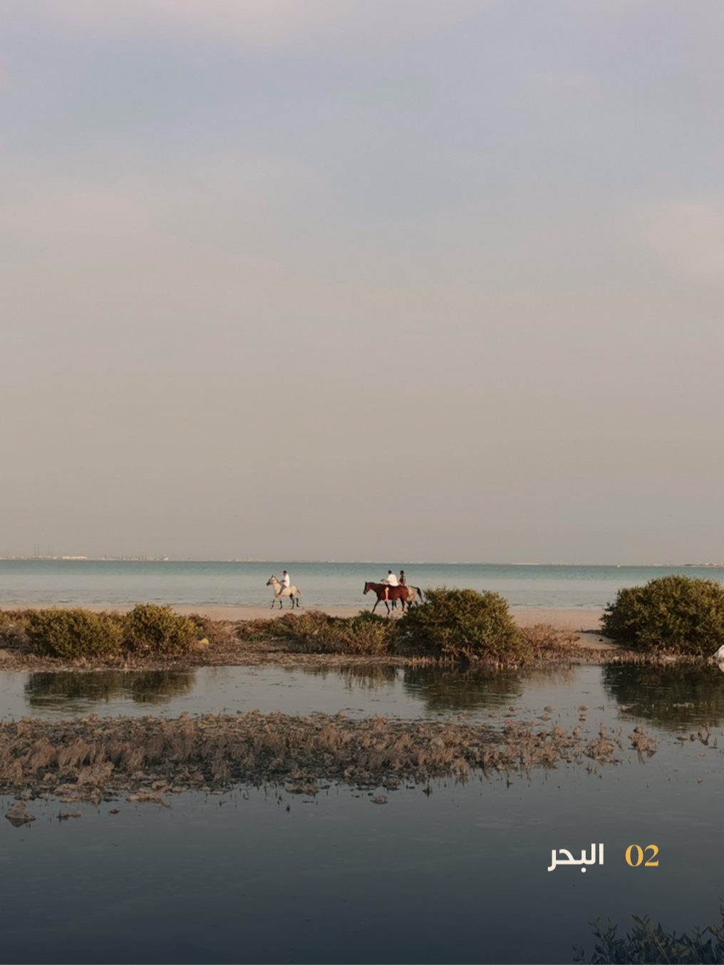
01The place
The castle and the sea.
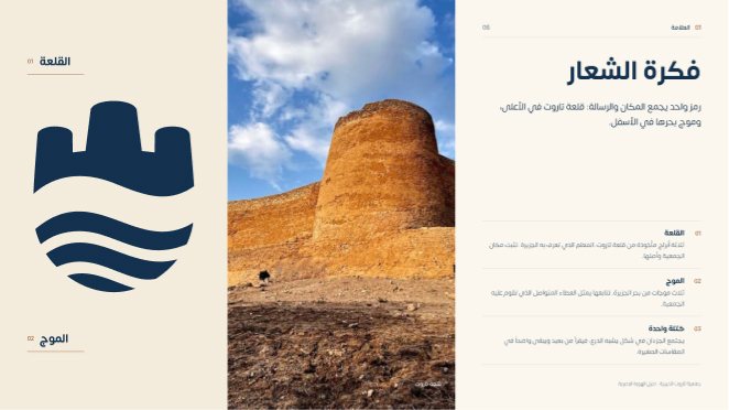
Tarout Castle is the island's best known landmark, and the sea surrounds the island on every side. I designed the mark from these two.
02The mark
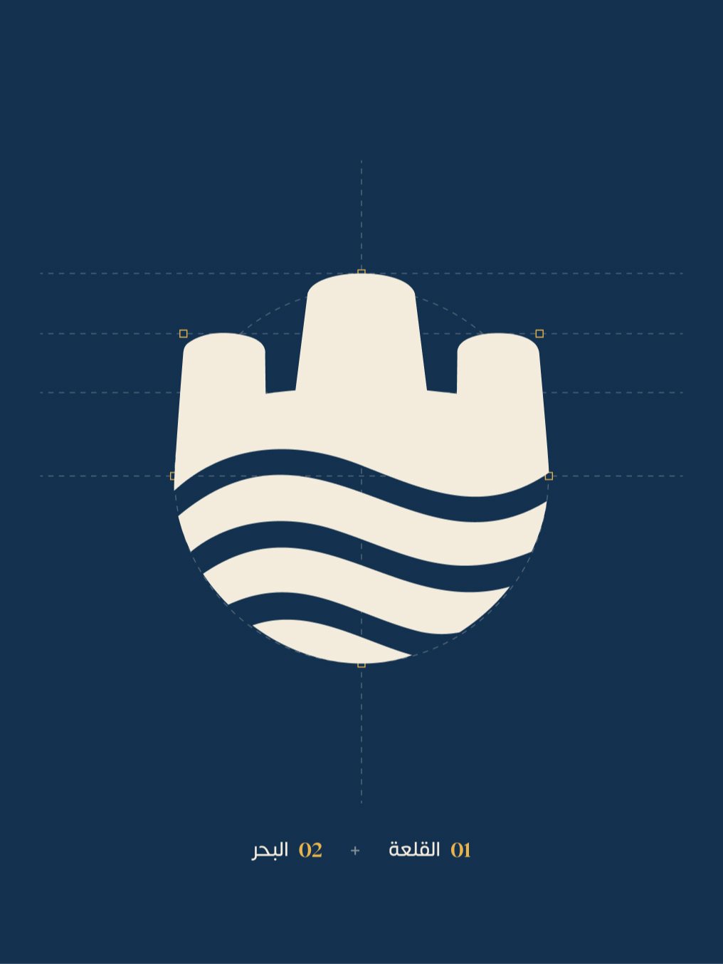
Three towersover three waves.
The towers come from Tarout Castle and hold the society's roots and place. The waves come from the island's sea, and their rhythm stands for giving that never stops. Together they form one shield-like shape that reads from a distance and stays clear at the smallest sizes.
03The name
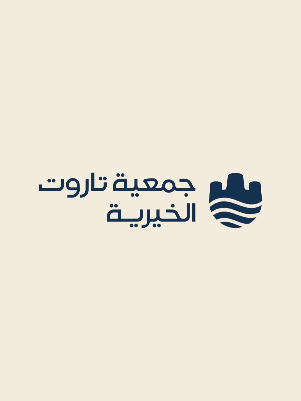
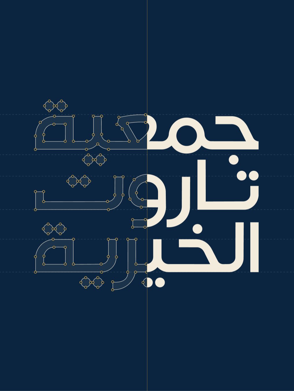
The name,as tall as the mark.
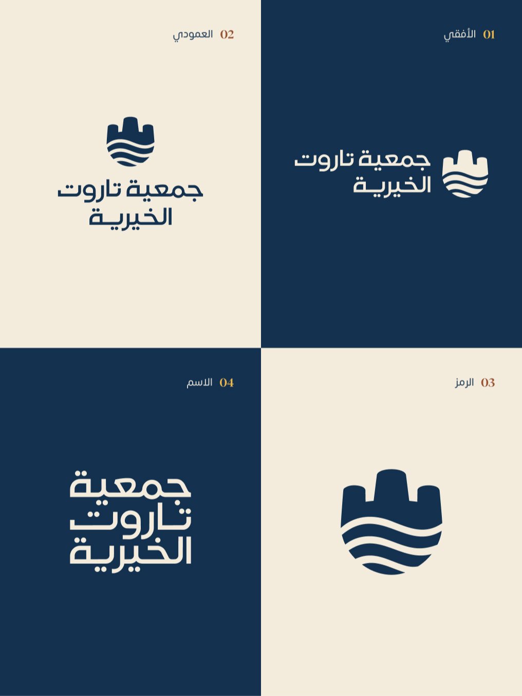
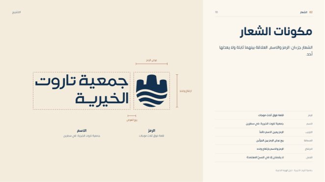
The name sits on two lines beside the mark at the same height, with a quarter of the mark's width between them. The logo has four approved versions: horizontal, stacked, the mark alone and the name alone.
04The element
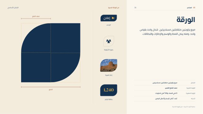
One shape,the whole system.
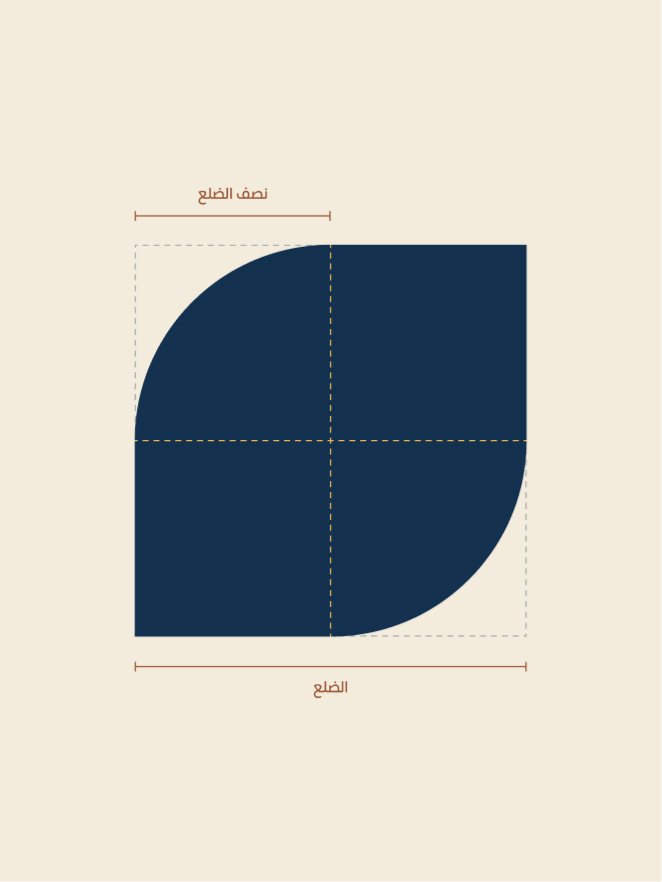
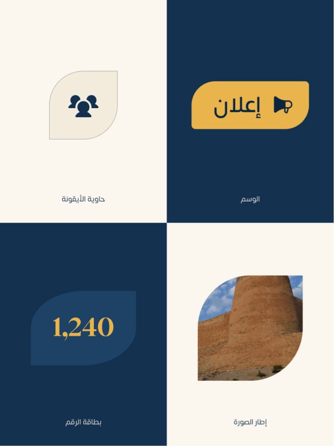
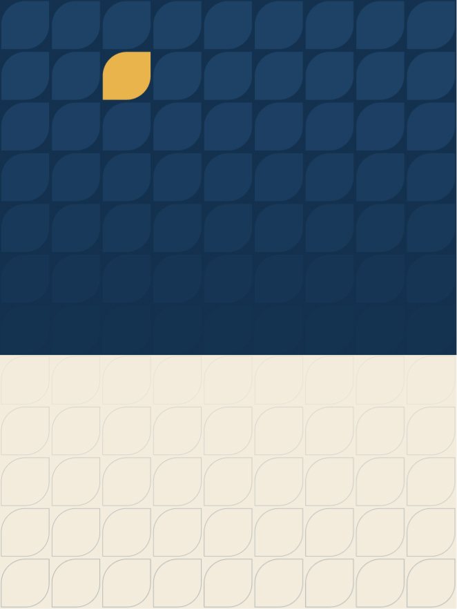
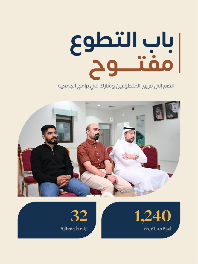
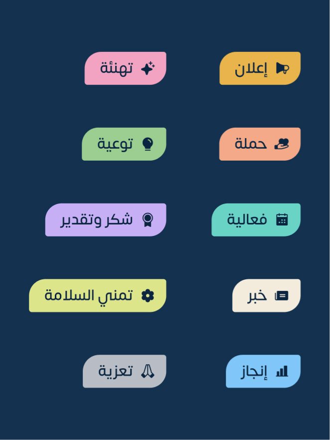
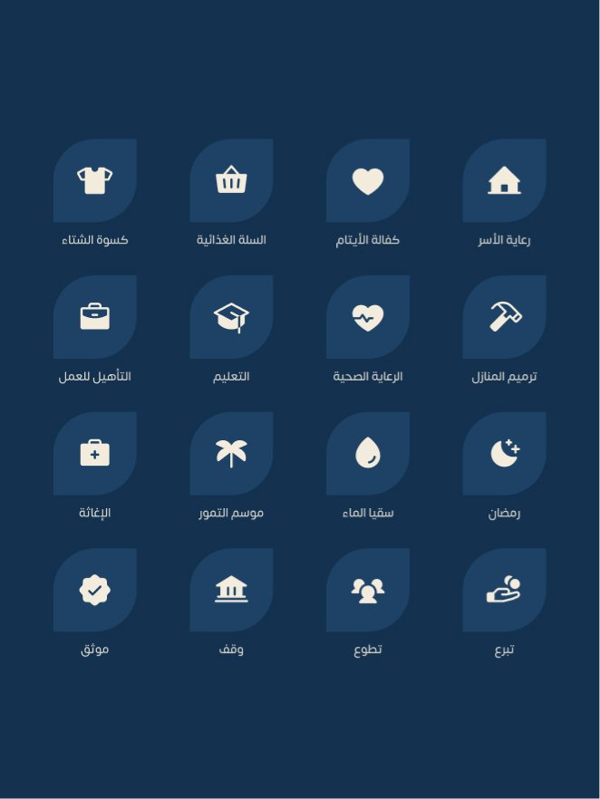
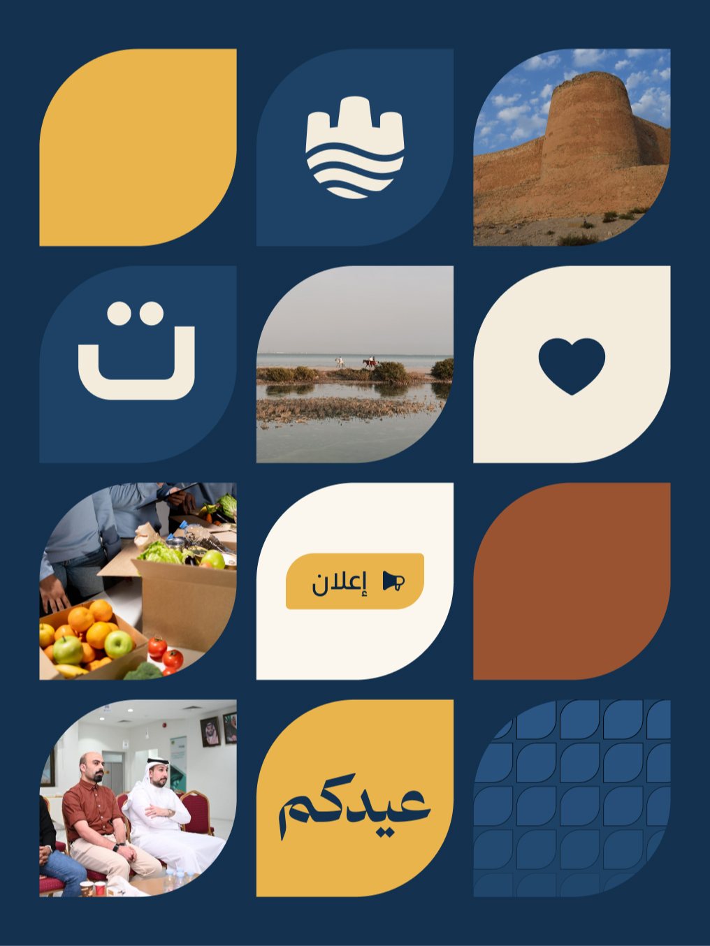
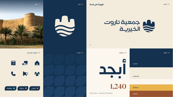
A square with two opposite rounded corners, called the leaf in the guidelines. The pattern, the post tag, the icon container, the photo frame and the number card all come from it.
05The system
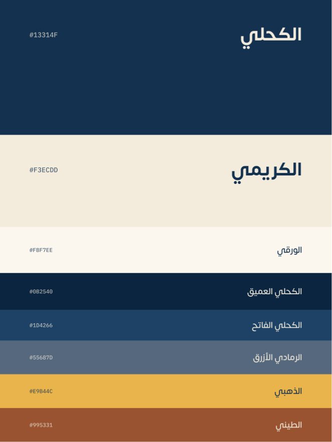
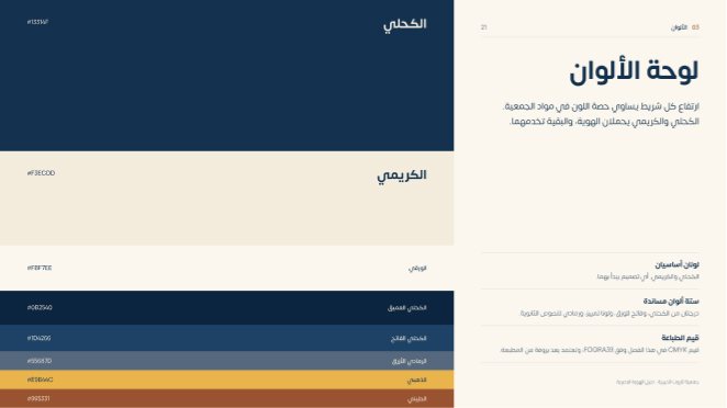
Two colours carry it,six support them.
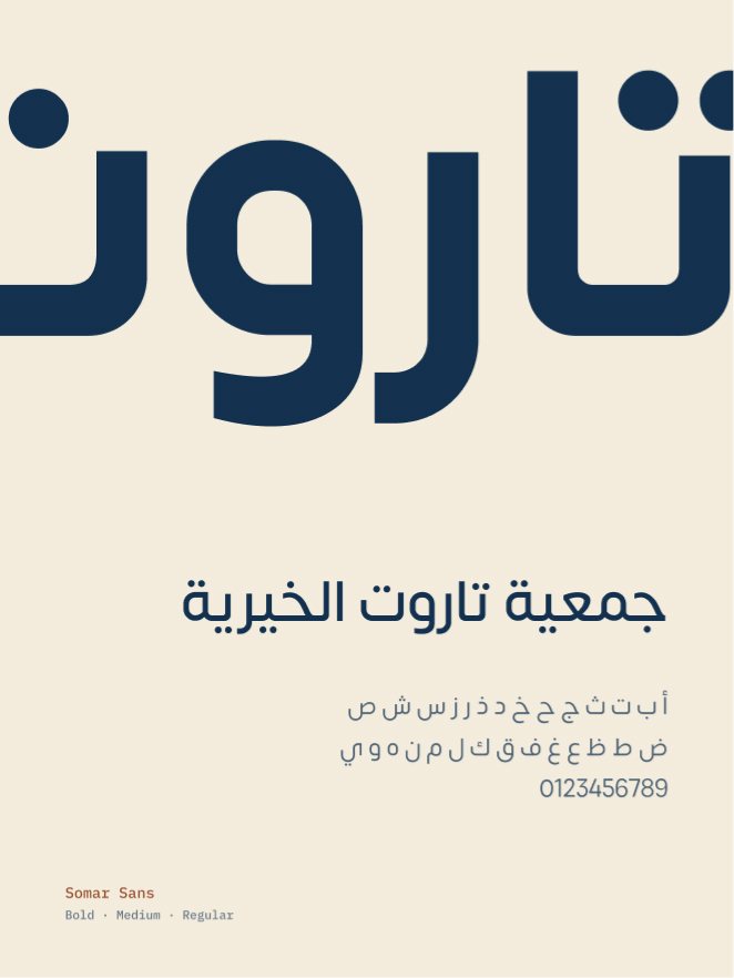
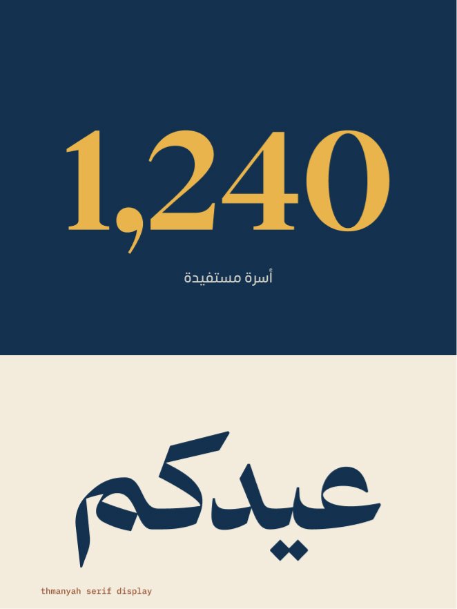
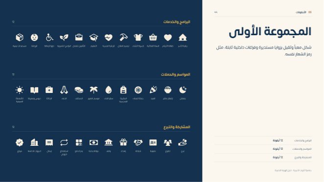
Navy and cream start every design. All text is set in Somar Sans, and Thmanyah Serif Display appears in only two places: the big number and the celebration word. Each type of post has its own coloured tag, and the icons share the weight of the mark.
06Applications
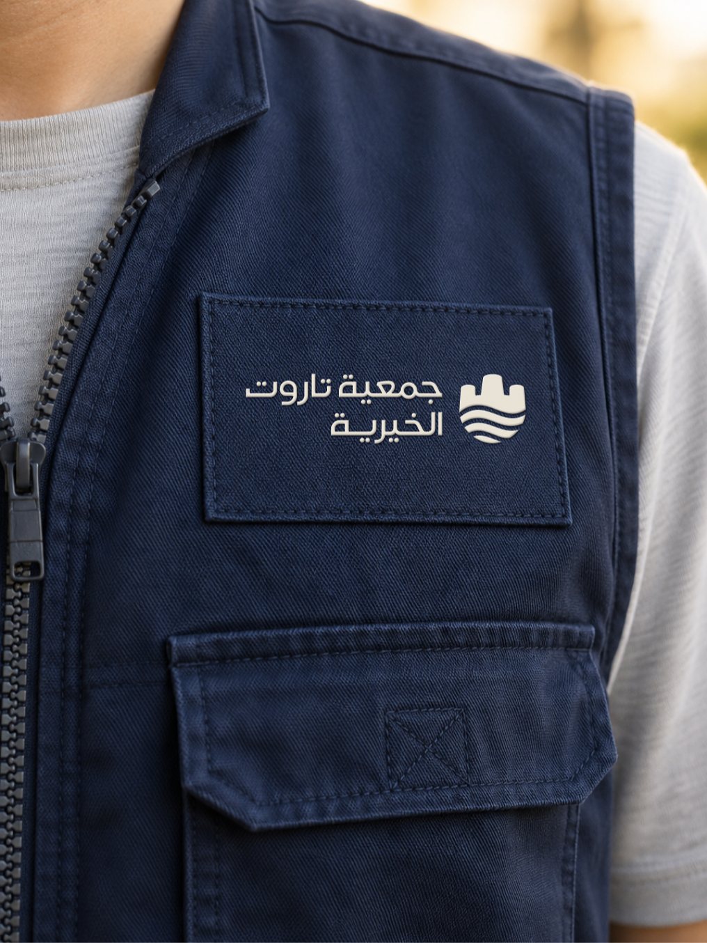
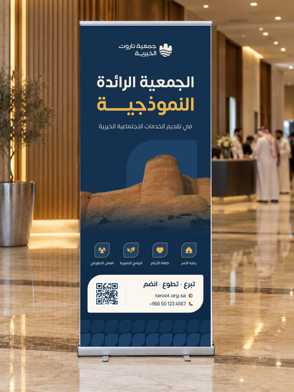
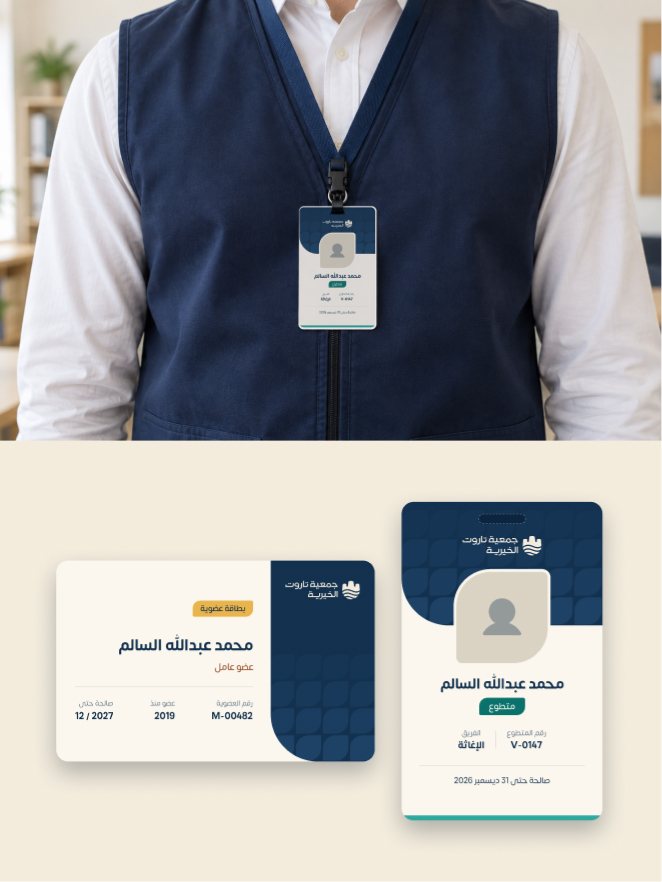
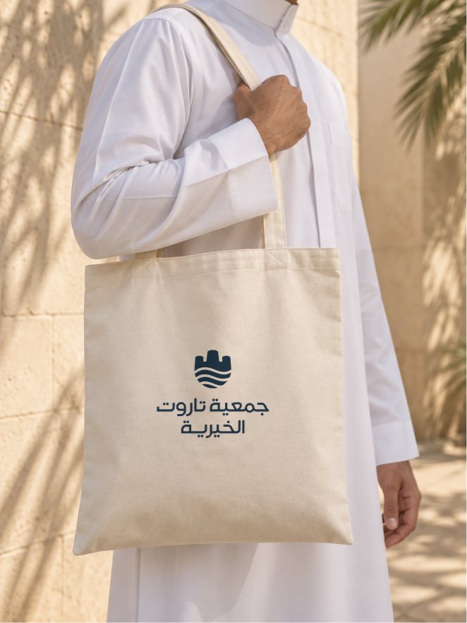
From the seal to the vest,one identity.
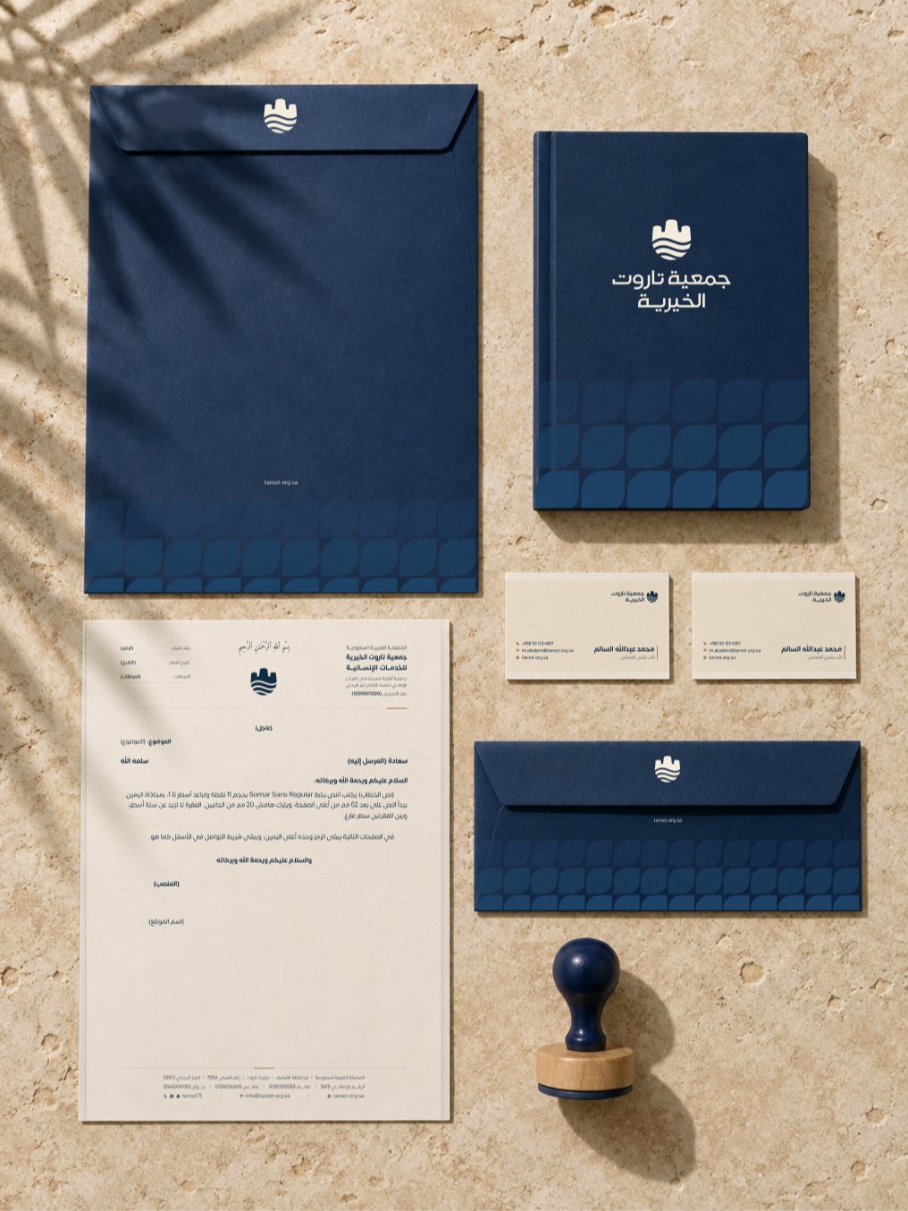
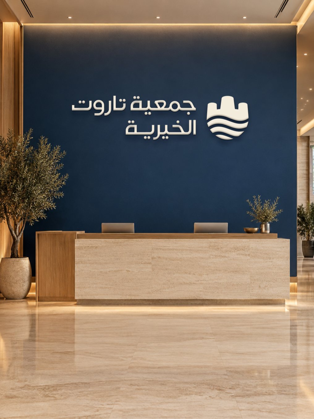
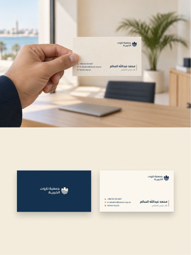
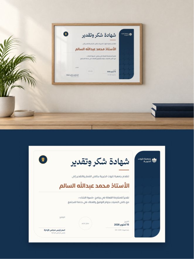
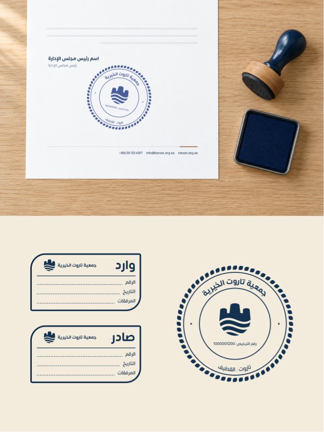
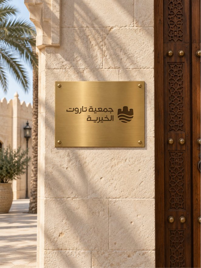
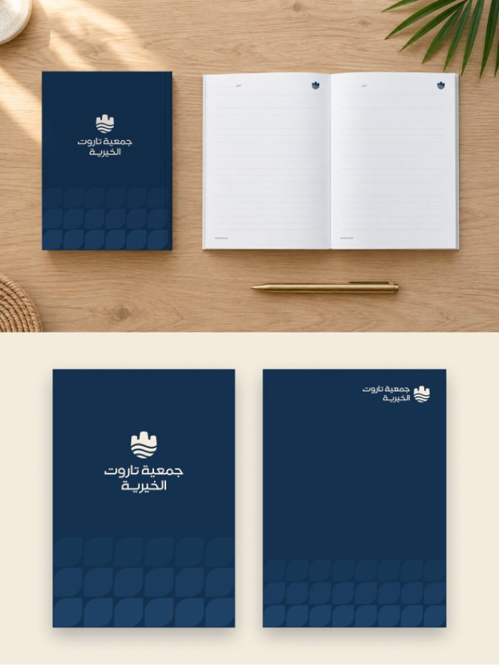
Stationery, certificates, volunteer and membership cards, signage and roll-ups. Every piece has its measurements in the guidelines and is ready for print.
07Platforms
Templates the teamfills in on its own.
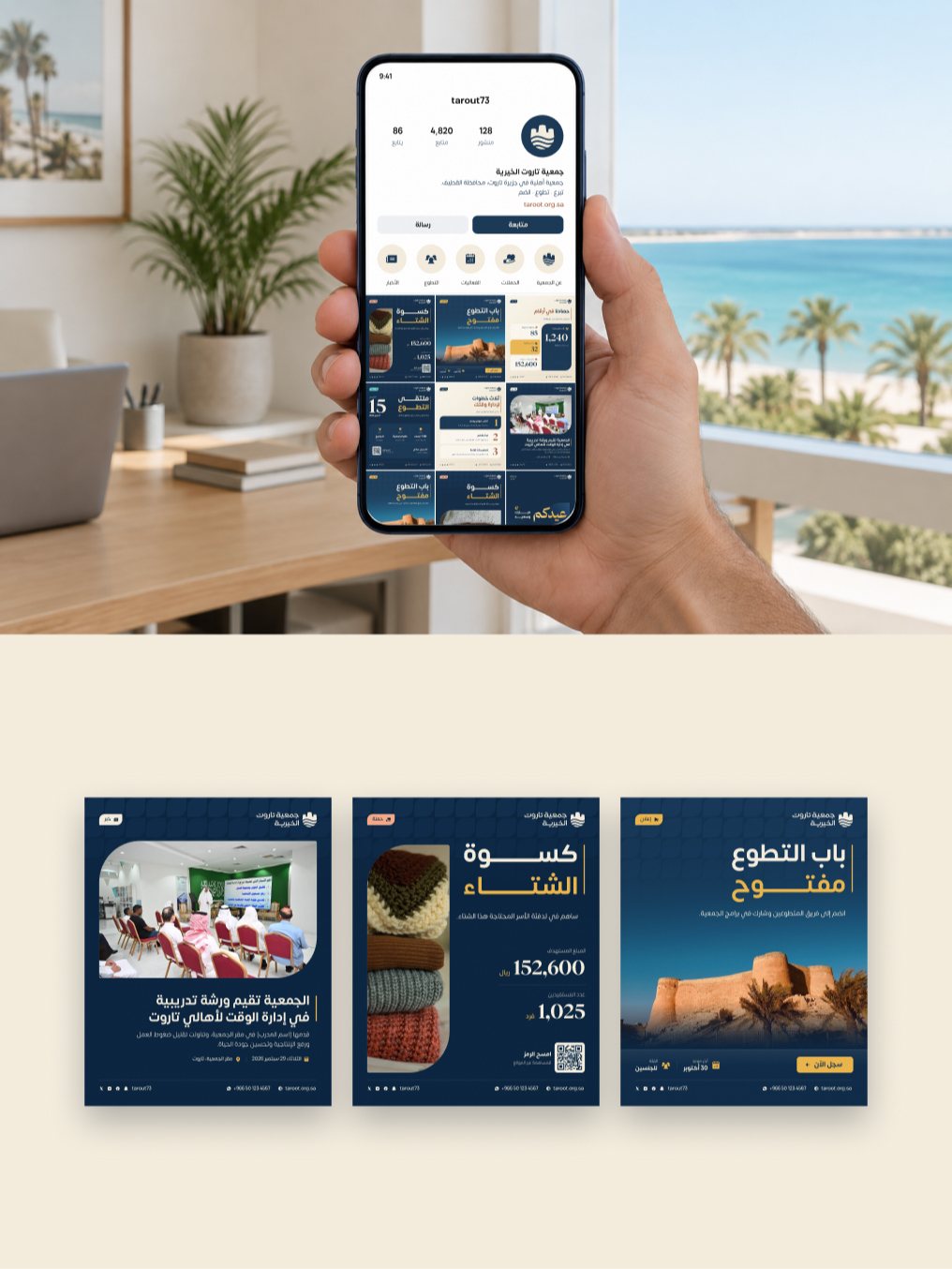
Post and story templates for every type of content, with the profile image, highlights, covers and email signature. The team changes the text, photo and number, and the layout stays fixed.
08Motion
The castle rises,the waves settle.
In seven seconds the castle rises from the horizon and the waves spread beneath it, then the mark moves into place and the name appears beside it.
09Guidelines
A 103-page guide.
Every rule in one file for the media team, designers and printers: logo, colour, type, elements, icons, photography and motion, print and platforms, plus a checklist before anything goes out.
- Client
- Tarout Charity
- Year
- 2026
- Sector
- Nonprofit
- Studio
- Design Arabi
Next project
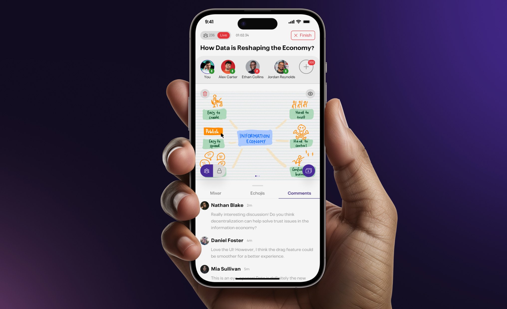
Poducer
Live podcast app
View projectBuilding something similar?
Write me a couple of lines about it, and I’ll reply by email.