Visual identity
Nazamah
A complete visual identity for a Saudi real estate company, from the mark to the brand guidelines.

The idea
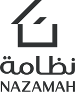
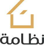
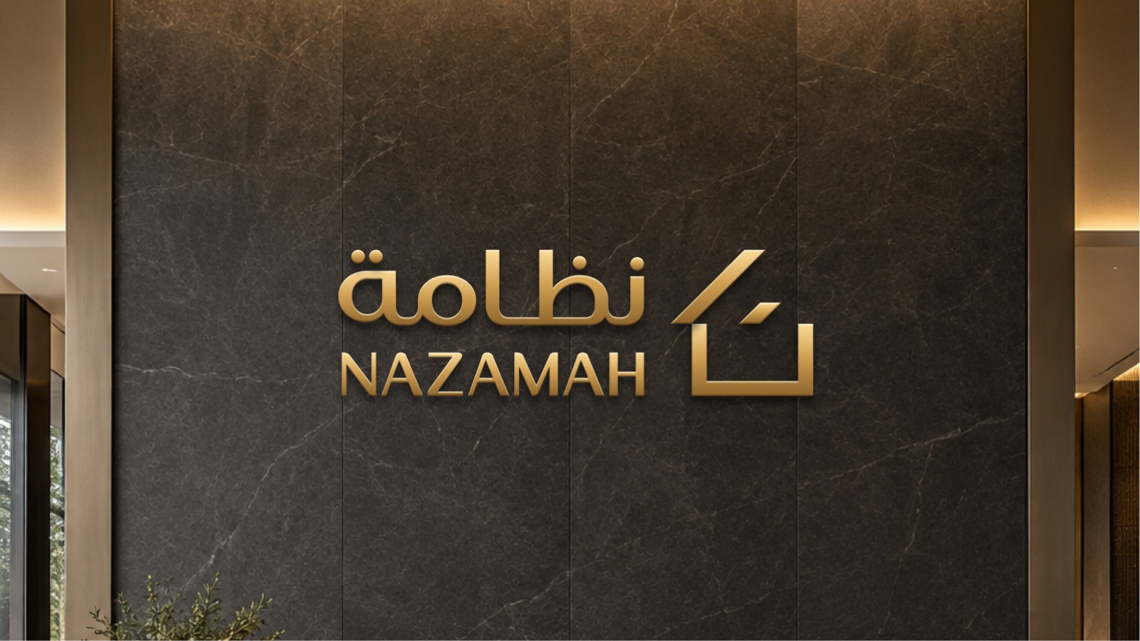
A house and the letter ن,in one mark.
Nazamah is a Saudi real estate company that buys land, divides it and builds on it. I designed a mark that joins the shape of a house with the first letter of its Arabic name, in geometric lines that suggest stability and luxury.

The system


- Black#303233
- Gold#DBAB5D
- Navy#1A2D47
- Grey#CFCFCF
Poppins · English typefaceNazamahReal Estate
Tajawal · Arabic typefaceنظامةالعقارية
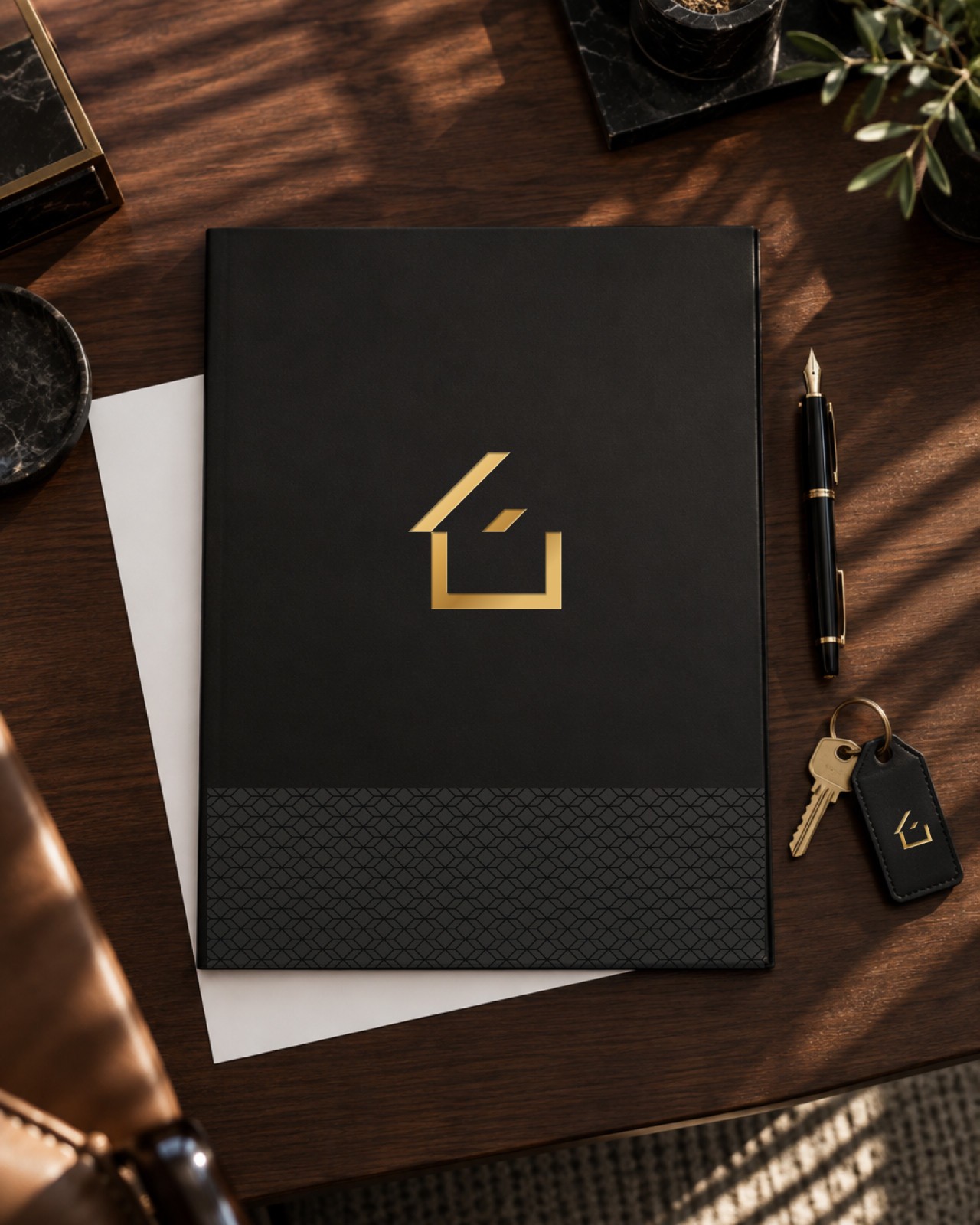
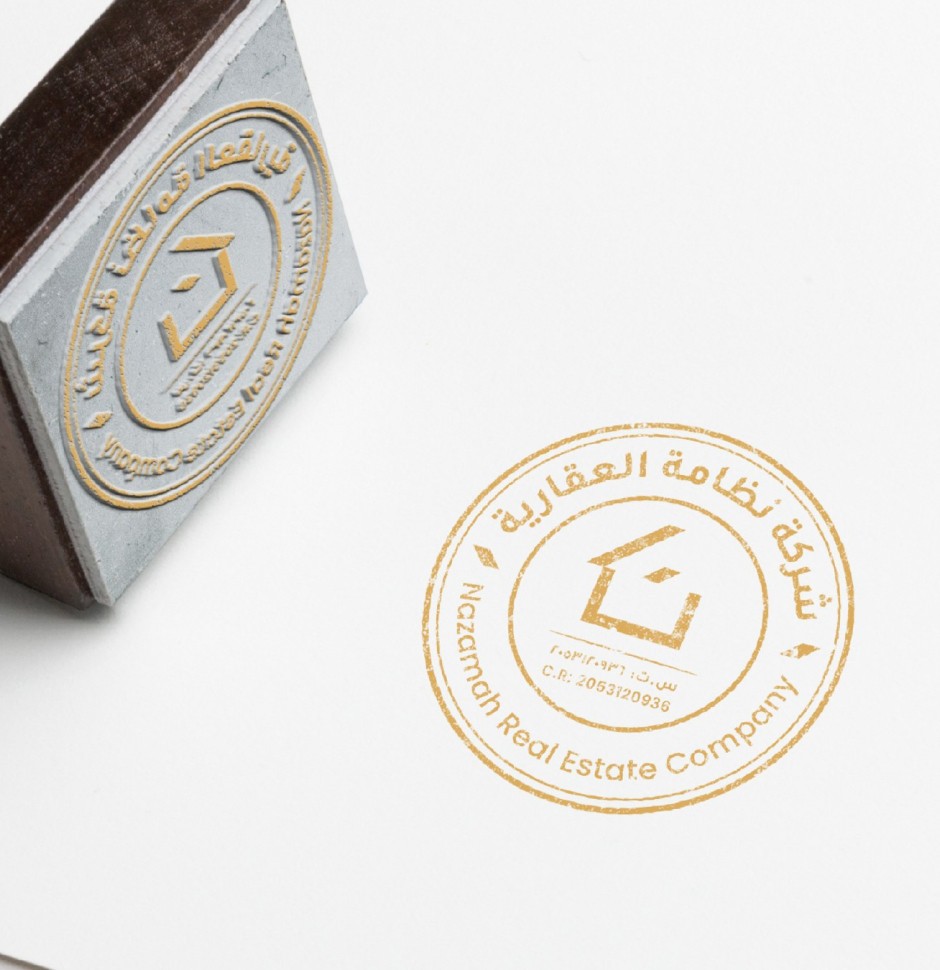
Applications
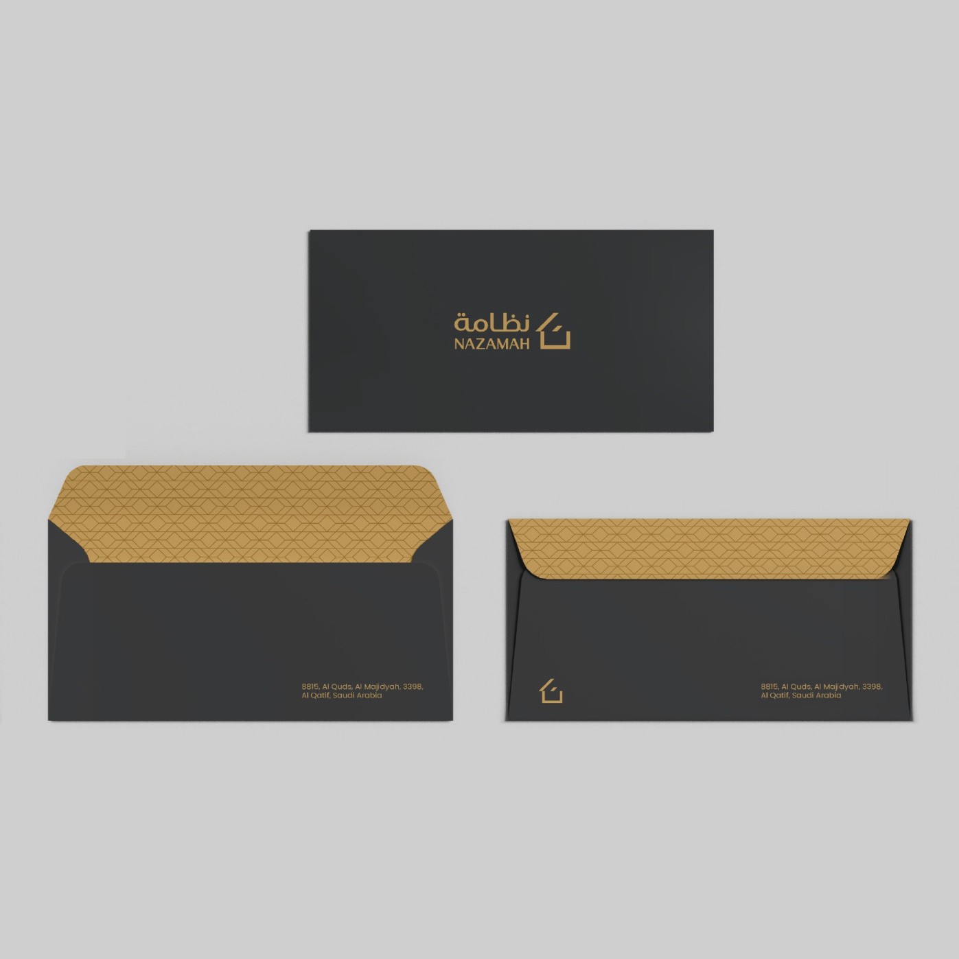
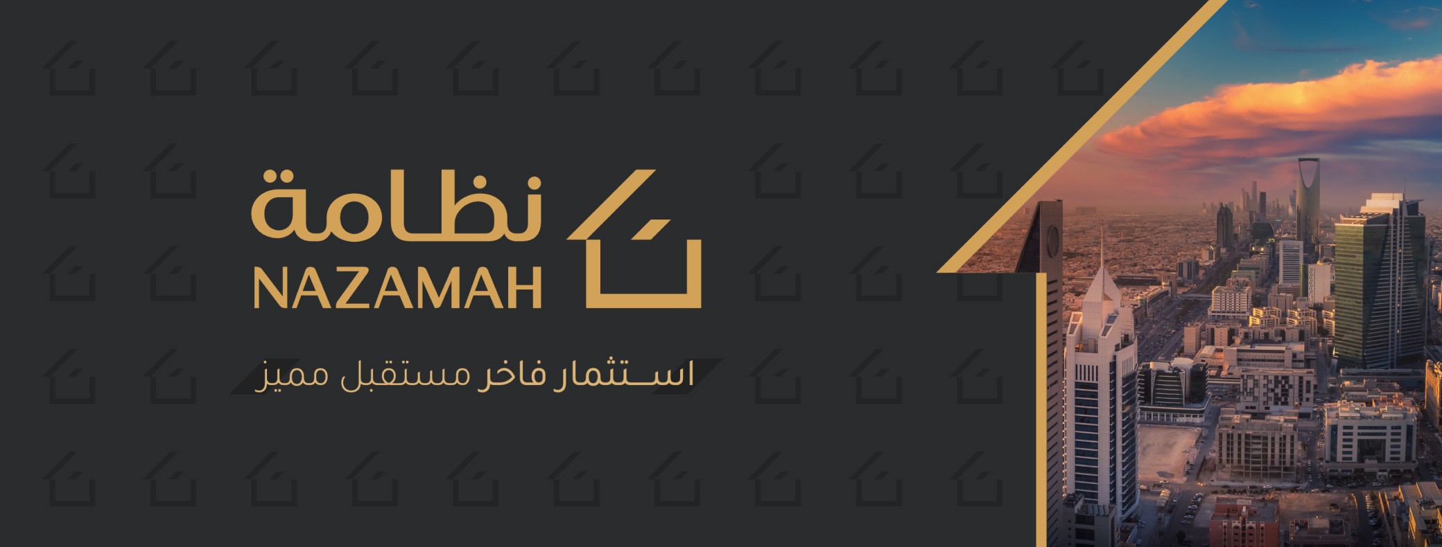
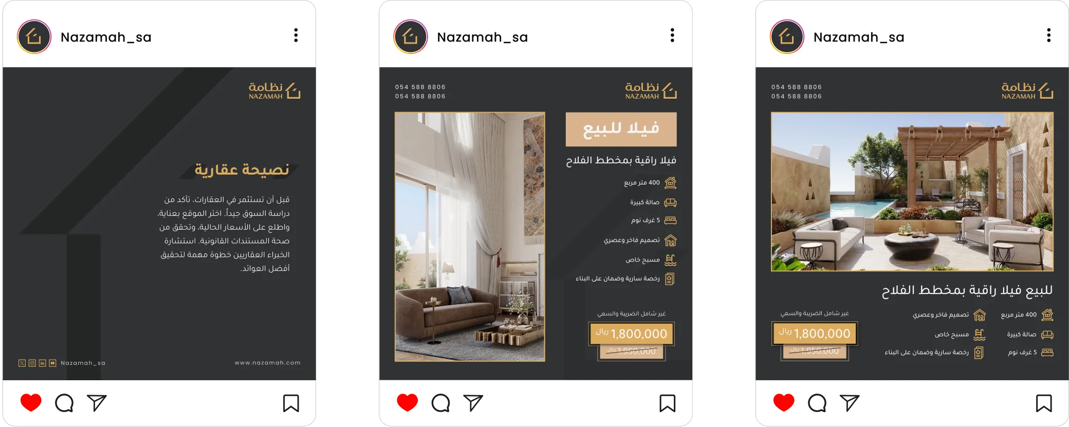
- Client
- Nazamah Real Estate Co.
- Year
- 2025
- Sector
- Real estate
Next project
Lariz
A visual identity for a womenswear brand
View projectBuilding something similar?
Write me a couple of lines about it, and I’ll reply by email.